



Fewer bright spots in the Eclipse dark theme on Windows
Some controls never quite joined the Eclipse dark theme on Windows: white tabs in a dark dialog, bright blocks in the toolbar, a light calendar. With the Eclipse 2026-12 release (4.42), they fit in.
Tabs without the white frame
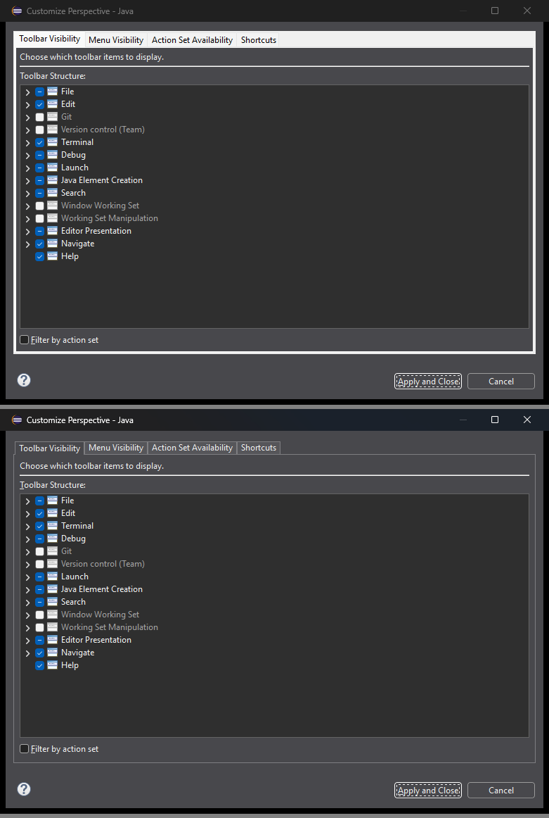
On Windows, TabFolder ignored setBackground and setForeground on its tabs, so dialogs such as Customize Perspective showed white tabs and a bright frame in the dark theme.
These colors now take effect.
A TabFolder with a color set paints itself and gets a flat look instead of the native one.
The Customize Perspective dialog before (top) and after (bottom):
Selected toolbar buttons
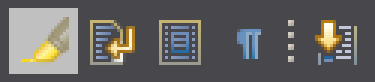
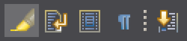
Selected toolbar buttons such as Toggle Mark Occurrences used to be a bright block on a dark toolbar. They now use a subtle color derived from the toolbar, so their icons remain easy to see. Hovered buttons follow the same color logic.
Toggle Mark Occurrences before and after:
Date fields and calendars
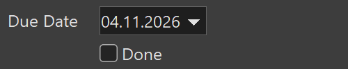
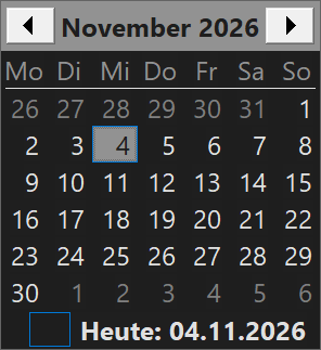
DateTime used to draw with light colors, even in a dark application.
Its month calendar, including the one in the drop-down, now follows the dark theme.
The date and time field is colored too, with the selected field still highlighted.
It has a flat border instead of the sunken native edge, and the drop-down button takes the field’s color, leaving just the arrow.
Trees and tables
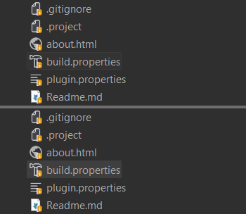
The selection of a Tree or Table without focus used to be nearly invisible in the dark theme, for example in the Project Explorer while you work in an editor with Link with Editor enabled.
It now has a subtle fill derived from the control’s background, which stays distinct from the focused and hovered states.
The light theme and high contrast mode keep their native look.
An unfocused selection on build.properties in the Project Explorer before (top) and after (bottom):
A smaller fix: a hovered and selected row of a multi-column Tree used to show two background shades.
All columns now use the same state, so it looks like one row in both the light and the dark theme.
Switching themes
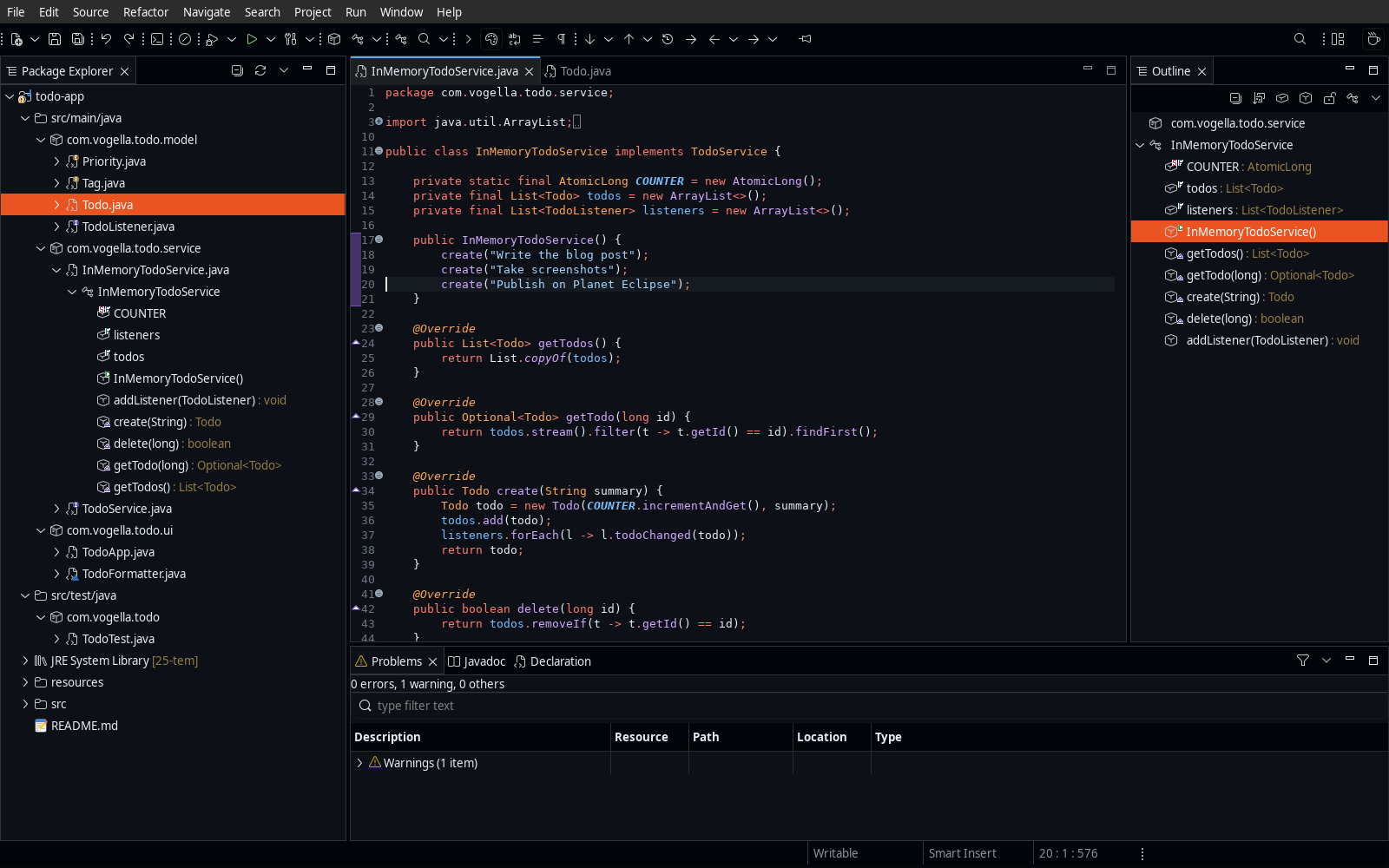
Not specific to Windows, but also new in 4.42: the Window > Appearance > Themes submenu lets you switch the theme without opening the preferences. It lists all installed themes, including custom themes contributed by plug-ins.
If you want more to choose from, try our themes with their modern icon sets.
For RCP and plug-in developers
These changes also affect your own applications on Windows.
As soon as you set any color on a TabFolder, it switches to the flat custom look.
This also applies if your application already sets colors that had no visible effect so far, for example only a foreground, or a background matching the parent.
Remove these calls if you want to keep the native look.
ToolItem.getBackground() now returns the color the item inherits from a parent with a background mode, instead of the system default.
This matches ToolBar.getBackground() and the behavior on GTK and macOS.
Colors set with ToolItem.setBackground() or ToolBar.setBackground() still take precedence.
DateTime.setBackground() and DateTime.setForeground() now take effect, and the matching getters return the colors in use.
These colors take precedence over the dark defaults and also apply outside of dark mode.
A DateTime without custom colors in light mode keeps its native look.
The changes are in the Eclipse SWT repository: TabFolder, ToolItem, DateTime, unfocused selection and Tree rows. The 4.42 New and Noteworthy has more for users and plug-in developers. If you spot another control that stands out in the dark theme, please open an issue.